5 Key Things You Should Consider Including in Your Labeling
We know that the use of labels is imperative for safety and efficiency, however, the design of our labels is equally as important. Whether it’s a warning sign or a pipe marker, the message conveyed needs to be clear, easily understood, and easy to spot. When labels are designed correctly you can prevent accidents, injuries, and other negative outcomes, while facilitating smooth and efficient communication.
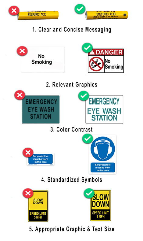
We have put together a list of five key things you should consider including in your labeling/signage to ensure that it is clear, concise, and effectively conveys its message. These include clear and concise messaging, relevant graphics, color contrast, standardized symbols, and appropriate graphic size.
1. Clear and Concise Messaging
Your label’s message should be clear and concise, using simple language that is easily understood, and avoid using jargon or technical terms that may confuse the intended audience. For example instead of designing your pipe marker to say "Sulfuric Acid" include important information like the direction of flow, and to & from information.
2. Relevant Graphics
Using relevant graphics or images can help reinforce the message and increase understanding. For example, a sign warning of a no smoking area may include a graphic of "no smoking" to make this message more visible and memorable.
3. Color Contrast
Using high-contrast colors can make the sign more noticeable and increase its visibility from a distance. Choose colors that contrast well, such as blue text on white background.
4. Standardized Symbols
Using standardized symbols and pictograms can make the sign more recognizable and increase its effectiveness across different languages. For example, the international symbol for "hearing protection" is a widely recognized symbol that is understood by people all over the world.
5. Appropriate Graphic & Text Size
The size of the text and graphics should be appropriate for the intended viewing distance and the information being conveyed. A sign that's message is too small may be difficult to read.

The proper design of your labels is crucial for safety and efficiency. If you keep in mind concise messaging, relevant graphics, color contrast, standardized symbols, and appropriate sizing. Designing effective signs for facilities and projects is crucial to ensuring the safety of employees, visitors, and the general public. By considering concise messaging, relevant graphics, color contrast, standardized symbols, and appropriate sizing, you can create a safe and organized environment that adheres to regulatory requirements and best practices. Want to ensure your labels are compliant? Browse our labeling standards informational sheets here.
If you would like assistance in designing labeling to meet your specific needs, we are here to help! Click the link below to receive more information or speak with one of our experienced team members.
